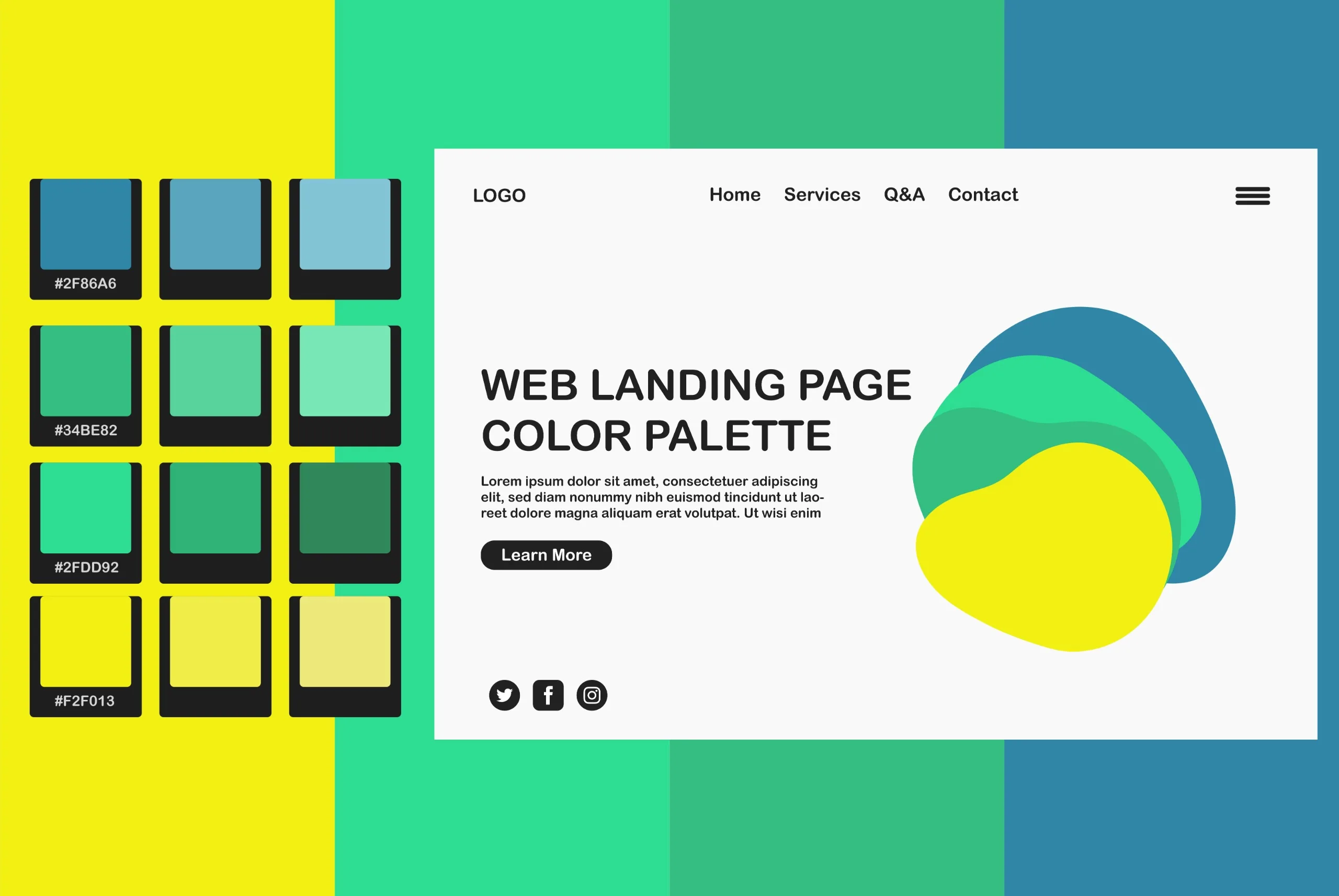
At PA Graphics, we believe that good design goes far beyond looking pretty. It is about strategy. Every shape, space, and shade has a role to play. One element that often gets underestimated is color. The colors you choose for a website can say more than the words on the screen. This is where color psychology comes in.
When we design websites for our clients, we think carefully about how colors will make people feel. Different colors trigger different emotions, and emotions influence decisions. That is why color can quietly guide how someone moves through a website, what they notice first, and whether they feel confident enough to take action.
Color Is More Than Aesthetic
Color is not just about branding or making things match. It is a tool that shapes user experience. For example, warm colors like red and orange are often linked to energy and urgency. These colors grab attention and can be useful for buttons or offers. On the other hand, cooler tones like blue and green tend to create a sense of calm and trust. They work well for businesses that want to build a sense of professionalism or safety.
Every color carries emotional weight. The key is using that weight to your advantage.
How Brands Use Color To Influence Behavior
Let us take a simple example. A fast food website might use a lot of red and yellow. Why? Because red can increase appetite, while yellow brings a feeling of happiness and excitement. It is not random. It is tested and intentional.
Now think about tech companies. Many of them use blue. That is because blue is seen as reliable and secure. It gives people a feeling of stability. Financial institutions often follow the same logic.
At PA Graphics, we help our clients choose color palettes that match not just their brand, but also the mindset of their audience. The goal is to create alignment between how a brand wants to be seen and how users actually feel.
Color Affects Readability and Focus
Beyond emotion, color affects usability. The wrong color contrast can make a website hard to read. A busy background or a poorly chosen font color can push people away, even if the content is solid. That is why we test color combinations for clarity and balance.
We also use color to guide attention. A well-placed splash of color can draw the eye to a call-to-action, highlight a feature, or break up long sections of text. Done right, color becomes part of the user journey.
Cultural Context Matters Too
Color meanings can shift based on culture. A color that means peace in one part of the world might carry a different meaning somewhere else. For global brands, we take cultural context into account. We always ask where your audience is located and how they are likely to respond.
For example, white may represent purity in some cultures, while in others it is used in mourning. These details matter when you are designing with purpose.
Our Approach at PA Graphics
When we start a web design project, we always begin with questions. Who is your audience? What do you want them to feel? What action do you want them to take?
From there, we build a color story that matches your goals. We explore palettes, test contrasts, and review how each element interacts with the rest of the page. Every design decision is backed by experience and guided by strategy.
For us, color is not decoration. It is direction.
Final Thoughts
If you want a website that feels right to your audience and moves them to take action, you need more than good visuals. You need a plan. Color psychology gives your design that extra layer of intention.
At PA Graphics, we blend creative thinking with proven design principles to build websites that do more than look good. They connect, convert, and last. If you are planning a new website or a redesign, let us help you choose the right colors for the right reasons.