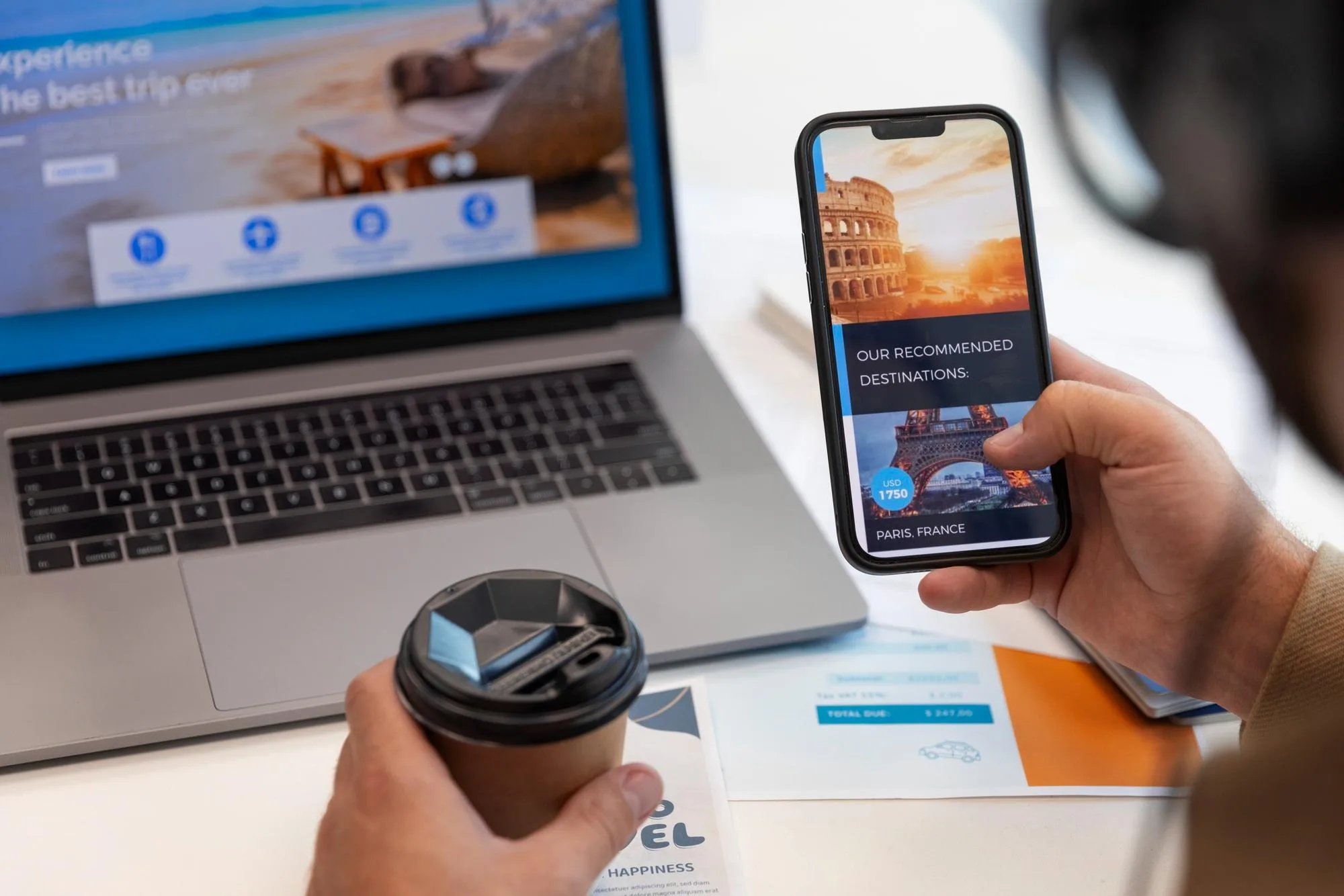
People now discover brands, services, and businesses through their phones first. When someone searches for a service, scrolls through a website, or tries to contact a business, it usually happens on a mobile screen. For a website design company in Kasaragod like PA Graphics, this shift has changed how websites should be planned, designed, and built. A site that works perfectly on desktop but struggles on mobile is no longer enough.
At PA Graphics, we see this every day. Customers expect websites to load fast, look clean, and feel easy to use on their phones. If a website fails to deliver that experience, users move on quickly. What this really means is that mobile friendly website design directly affects how people view your brand and whether they choose to connect with you.
Mobile is the first touchpoint for most users
Smartphones are always within reach. People use them while travelling, during breaks, and even while relaxing at home. When someone hears about a business or service, the first action is often to search it on their phone. If the website opens slowly, text looks too small, or buttons are hard to tap, the first impression is already damaged.
From our experience at PA Graphics, businesses that invest in mobile friendly design see better engagement. Visitors stay longer, explore more pages, and feel more confident about the brand. A smooth mobile experience makes users feel that the business is professional and trustworthy.

Search engines reward mobile friendly websites
Search engines focus heavily on mobile usability. Websites that perform well on mobile devices are more likely to appear higher in search results. This is not about tricks or shortcuts. It is about providing real value to users.
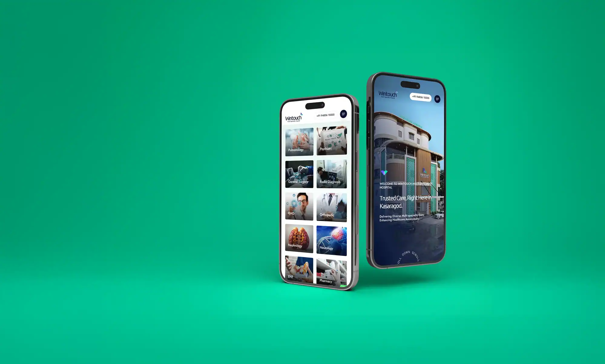
When a website is designed with mobile users in mind, it naturally follows better structure, readable content, and faster loading times. These factors help search engines understand the website better. As a website design company in Kasaragod, PA Graphics builds websites that follow these principles without compromising on design or clarity.
Better user experience leads to better conversions
A mobile friendly website is not just about resizing content. It is about how users interact with the site. Navigation should be simple. Content should be easy to scan. Forms should be quick to fill. Contact details should be visible and accessible.
When users can find what they need without effort, they are more likely to take action. This could be making a call, sending a message, or requesting a service. At PA Graphics, we focus on designing websites that guide users naturally toward these actions, especially on mobile screens.

Speed matters more than ever
Mobile users are impatient. If a website takes more than a few seconds to load, users leave. Heavy images, unnecessary elements, and poor structure slow down websites and hurt performance.
Our approach at PA Graphics is to design clean and purposeful websites. We focus on what matters and remove what does not. This results in faster loading times and smoother performance across devices. Speed is not just a technical detail. It directly affects how users feel about your brand.
Consistent brand experience across devices
Your website is a reflection of your brand. Whether someone views it on a phone, tablet, or desktop, the experience should feel consistent. Colors, typography, and layout should adapt smoothly without losing identity.
PA Graphics ensures that every website we design maintains brand consistency across all screen sizes. This helps businesses build recognition and trust. A well designed mobile experience shows that a brand cares about details and values its audience.
Building trust through thoughtful design
Trust is built through clarity and ease. When users land on a mobile friendly website, they feel comfortable navigating it. Clear headings, readable text, and intuitive layouts create confidence.
We believe good design is not about adding more elements. It is about making the experience simple and meaningful. At PA Graphics, our design process focuses on understanding user behavior and designing websites that feel natural to use on mobile devices.
Why businesses choose PA Graphics
PA Graphics specializes in creating websites that balance design, usability, and performance. We work closely with our clients to understand their goals and present their brand clearly on every device. Our experience with clients across different regions allows us to design websites that connect with diverse audiences while maintaining strong visual identity.
If you are looking for a website design company in Kasaragod, across regions or globally, that understands the importance of mobile friendly design, PA Graphics is here to help. We design websites that are easy to use, visually appealing, and built to perform well on mobile screens. If you want to improve your online presence and connect better with your audience, contact us or reach out to our team today. We work with clients across regions and globally, offering consistent quality and reliable support.
What does mobile friendly website design mean
It means a website is designed to function smoothly on mobile devices with easy navigation, readable content, and fast loading times.
Why is mobile design important for businesses
Because most users access websites through their phones, and a poor mobile experience can lead to lost visitors and missed opportunities.
Does mobile friendly design help with search visibility
Yes. Search engines prefer websites that offer good mobile usability, which can improve visibility in search results.
Can an existing website be improved for mobile use
Yes. With proper design updates and structure changes, many websites can be optimized to perform better on mobile devices.
How can PA Graphics help with mobile friendly website design
You can contact us or reach out to PA Graphics to discuss your requirements. Our team will guide you through the process and create a website that works smoothly across devices and supports your business goals.