
At PA Graphics, we meet business owners every week who come to us excited about creating their first logo. Some already have a vision in mind while others admit they feel completely lost. No matter where you fall on that spectrum, the truth is the same: your logo is not just a nice piece of artwork. It is the face of your brand. It will show up on your website, your business cards, your packaging, even the invoices you send out. Before you start working on it, there are a few things every business owner should know.
A logo is not just design, it is identity
When someone sees your logo, they form an impression about your business in seconds. It is not about picking colors you like or a font that looks stylish. It is about creating a mark that represents your values, your tone of voice, and the type of customers you want to attract. For example, a childcare center might lean toward warm playful colors, while a law firm might focus on clean lines and professional typography. Both are logos, but they tell very different stories.
Simplicity always wins
One of the biggest mistakes we see is business owners trying to cram too much into their logo. They want a symbol, a tagline, a full-color palette, and maybe even a background illustration all at once. The result usually feels cluttered and hard to use. The strongest logos are simple, clear, and memorable. Think about the Nike swoosh or Apple’s bitten apple. Neither needs extra decoration because the design is strong enough on its own.
When we design logos at PA Graphics, we focus on what can be recognized instantly. A simple design is not only easier for customers to remember but also works better across different platforms.
Versatility matters more than you think
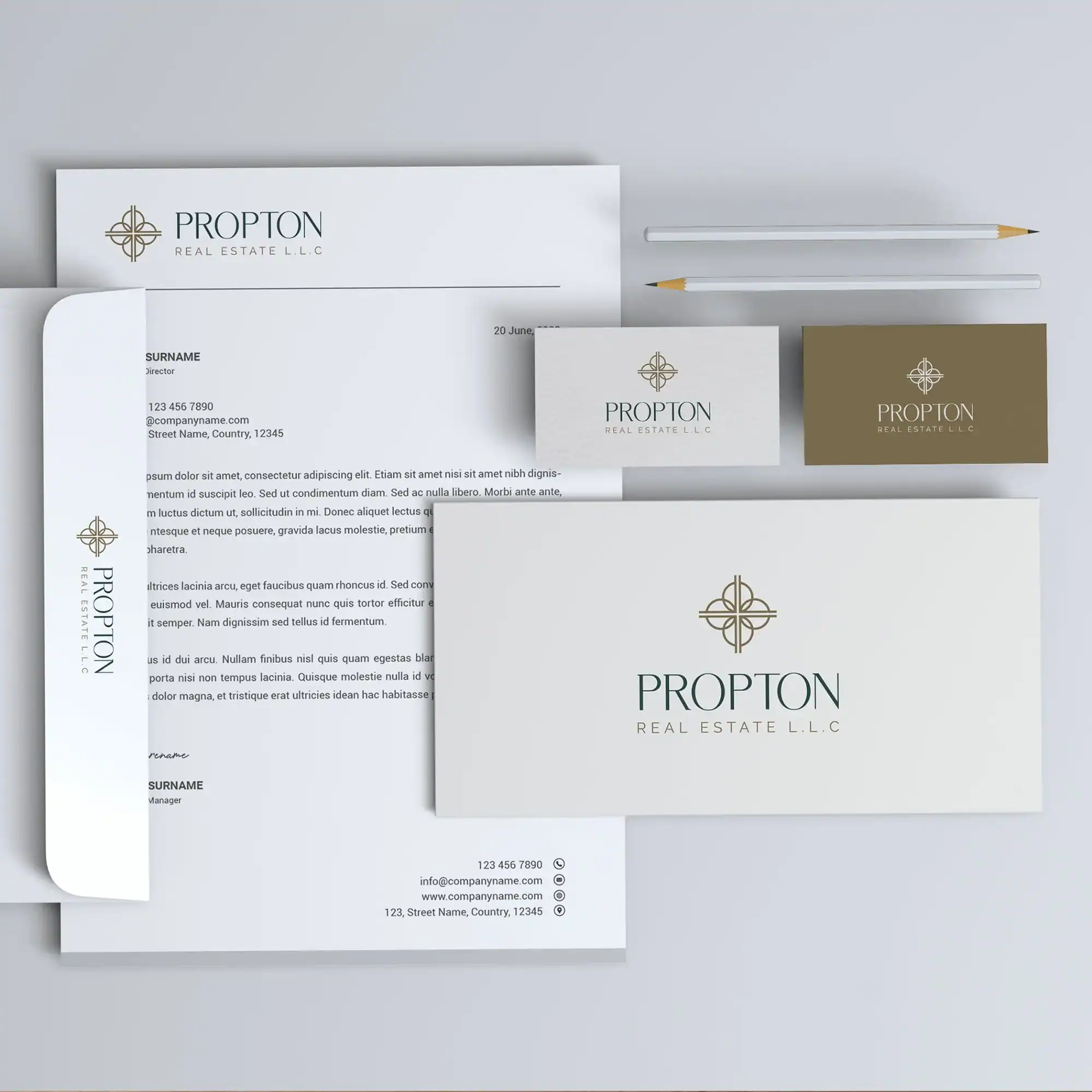
Your logo is going to appear in a lot of places: online ads, product packaging, uniforms, brochures, maybe even on a huge banner one day. A design that looks nice on your phone screen might completely lose impact on a billboard. This is why we always design logos that can scale. They should look sharp whether they are printed in tiny size on a business card or blown up for an event backdrop.
Another factor is color. You want your logo to work both in full color and in black and white. There will be times when your brand will be represented in a single-color format, and a well-crafted logo will still hold its strength.
Color psychology plays a role
Choosing colors is not just about what looks pretty. Different colors create different emotions in people. Blue often conveys trust and reliability, which is why so many banks use it. Green suggests growth and health, making it popular for eco-friendly brands. Red grabs attention and can communicate energy or urgency. At PA Graphics we help clients pick colors that align with their brand’s personality rather than just their personal favorites.
Fonts are just as important as symbols
Even if your logo does not include an icon, the typeface you choose sends a clear message. A handwritten script feels approachable and creative. A bold sans serif looks strong and modern. A serif font gives a classic and trustworthy vibe. Sometimes we design custom lettering for logos so that the brand name itself becomes iconic. If your font choice feels off, it can completely change how people perceive your business.
Do not follow trends blindly
Every year new design trends pop up and it is tempting to jump on them. But here is the issue: trends fade quickly. If you want a logo that lasts for the next decade or longer, you need something timeless. We often tell our clients to think long term. A trendy effect might look fresh today but could make your brand feel outdated in just a couple of years. A timeless logo saves you the cost and confusion of constant redesigns.
Your logo should reflect your audience, not just you
It is natural to want a logo you personally like. But the most important test is whether it speaks to your target audience. You are building a brand for them, not just for yourself. That means understanding what appeals to your customers, what feels trustworthy to them, and what style will attract their attention. When we work with clients, we spend time learning about their market before putting pen to paper.
Professional design makes a difference
Some business owners try to cut corners by designing a logo themselves with free tools. While it might save money in the short term, it usually ends up costing more in the long run. A logo designed without professional knowledge often lacks the versatility, balance, and originality that a business needs to stand out. At PA Graphics, our goal is not just to make something that looks good but to craft a logo that works as a strategic tool for your business.
Final thoughts
Starting a logo is exciting because it feels like the beginning of your brand’s story. But it is not a step to rush through. Think about your audience, your values, and the long-term picture of where you want your business to go. A logo should be simple, versatile, meaningful, and timeless. It should help customers remember you for the right reasons. Take a look at some of the brands we’ve designed, we let the work speak for itself.
At PA Graphics, we love guiding business owners through this process. If you are ready to build a logo that does more than just decorate your brand, we are here to help you create one that truly represents who you are. Let’s design your brand’s identity, contact us.